1.23.2012

Radiation


         Originally, I focused on the principles of a Japanese house: large common space in the center surrounded with gardens and private spaces.  I wanted to remove the formality of 
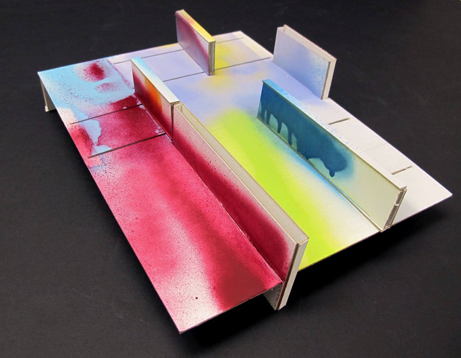
each space by eliminating its walls.  As seen in my second model, each space is dictated by floor height and floor material. The path receives natural light from a roof skylight and the important, highly visited rooms are against the streets to allow for floor to ceiling windows.
            My third model is based on radiation.  A book radiates an idea from author to the reader and from reader to his/her peers.  Media radiates information through society.  Our society is moving from solid, concrete forms of media to far more abstract forms.  Architecturally, the space is organized from dense, closed masses to open, abstract space.    
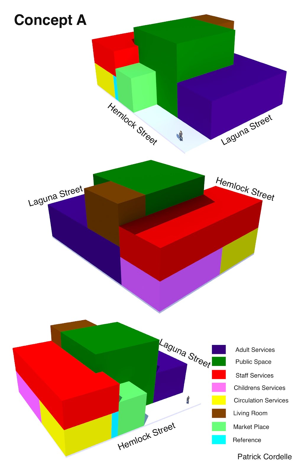
                  This scheme is divided into three floors, before the radiation (the visitor acts as the atom and the masses act as the molecule), during (the molecule breaks apart and the masses are dispersed throughout the space), and after (masses reassemble and a clearing is formed).  The dense stairwell through the heart of the building binds the floors together, and mimics the path the atom takes as it collides with the molecular masses.  
The first floor holds the public spaces and the great garden that rises through to the second and third floor.  This floor aims to transport people to a more calm and relaxed environment, but allows for those in a rush to get what they need quickly. The second floor is composed of two L-shaped spaces.  One holds the denser masses, the Adult and Children’s Service rooms and the other holds the more private nooks and niches against the garden for more solitude. The third floor holds offices and a roof garden open to guests and available for public events.  

_engawa


All three of my concepts are different but have one common theme – the idea of the engawa. Theengawa is traditionally the thin wooden strip of floor between the interior of the house and the exterior. It is covered by a roof overhang and raised slightly off the ground level so that it functions as a step and a long bench. It is important in Japanese architecture because it defines the edge of a space and it a transition point between the interior and the exterior. It can be interpreted as just that – the traditional wooden porch- or as more of an implied idea of enclosing space without actual walls.

The three different concepts address the engawa idea in two main ways. A series of rooftop gardens allow for an outdoor space, which can be used as a refuge from the urban monotony that exists on the street level. A difference in the way that the main program areas are aligned horizontally allows a certain level of interaction vertically, especially through an enclosed atrium space that spans two or three levels of the building.

The other way that these concepts address the engawa is through the use of cantilevered overhangs.Main spaces are located on the upper floors and spread out over the open space below. The concepts all are set back from the street to allow circulation of foot traffic through the lower level and integrate the library with the streetscape. This allows people on the street level to come into the space without fully committing to entry. The overhang defines the edge of what is public property and what is part of the library. However, being a library – an inherently public space – the distinction between public and private is significantly blurred.


Program massing


For scheme one, I focused on the idea of using natural light and a large surrounding window area to define the introverted and extroverted spaces of the library program. The library is divided into three floors, each organized with the extroverted areas such as the circulation, market place, public space, and children, located closer to the street side where light is prevalent. The introverted areas such the adults and reference collection are located in the cornered area surrounded by the neighboring buildings. This scheme emphasizes the idea that light and nature define the introverted and extroverted spaces of the library.

For scheme two, I continued with the idea of nature and people areas joining together. I used the idea of walking through a park to inspire this scheme in which the program is cut across the center as people are exposed to nature through terraces and gardens on both sides. As the floor level increases, so do the seclusion and introversion of the spaces .

For scheme three, I decided to separate the entire library into three main spaces, placing the introverted program along the cornered section of the site and placing the extroverted spaces along the streetside. In the center is a garden terrace that connects the two contrasting sections of the library together. On the second floor is the staff area, located in neither the introverted nor extroverted spaces, but rather in the center overlooking it all.

Library Concepts: Spiral Pathway, A Literary Garden, and The Hill

Most libraries are a set of blocked out spaces according to program; children’s books, adult’s books, other media. People go to their assigned area, get what they need, and leave. While being a great resource, this hardly encourages community interaction. With my three different concepts I wanted to try to create an environment that allowed the user to experience the space, the media, and the community there.
Concept #1 - Spiral Pathway
With my first concept I started with the idea of a winding path. In a garden the path directs your attention and pulls you through spaces. So I created, not a path through the library but the entire library as a winding, coiling path around an inner atrium community living room. This would allow the user to experience all of the spaces of the library not only from passing through, but also from seeing the other spaces from different vantages.
Concept #2 - A Literary Garden
My second concept was one of bringing in light and nature inside the library. Instead of dark segregated spaces, the library would be divided only by small glass enclosed gardens with light spilling out around no matter how dreary the weather. All the “rooms” would be visually connected through open area and through the gardens.
Concept #3 - The Hill
Along with bay windows, the sloped hills of San Francisco are iconic. If you flattened the city it would lose so much of it’s character. So I applied the reverse concept on the library. What if I took the flat floorplan and gave it the slope of the hill. My third concept was the result. With alternating sloped and level planes the interior has a rippling floor and almost no interior walls. Every single space is accessible via a ramp while each step is only six inches maximum allowing access to any spot for anyone.

3D PROGRAMS


Program one has got the idea of combining spaces of the program. The circulation services, the community living room and the market place are combined to one space and they are having a separate entry to provide a quick and short access to the fast living places of the library.
A recognizable entry situation should be achieved by locating the building in one corner of the lot and create a public outdoor space. A semi public space, which is an additional space to the given program.


The program two is based on the idea of the capsule tower by Kisho Kurokawa. The public space functions as center column over 5 stories, on which all the other spaces circle around. The second floor or rather its spaces are cantilevered over the first floor to create a shelter over the outside space in rainy SF.


Program three is all about being extremely compact. The proposal just touches two of the four property lines. This generates a lager outside space and supports the idea of Japanese’s high density building style.
The public space is again the center of the library in this proposal. It’s taller then the other spaces and makes its job as an access space for most of the other facilities of the branch library. There is a separate access to the circulation services and the community living room.


When tackling the concept of a massing model I personally felt the need to decipher a tactic to minimize the complexity of the library as a whole. Never having dealt with a program for a project that was this large or detailed, I first tried to group together similar elements of the program in an attempt to group floor levels of the library. Seeing how the site at its maximum capacity may only hole roughly 6300 sq. ft. we must use multiple levels to achieve the 9200 sq. ft. program. Taking principles of the conventional library, the program ascended the building concept with a transition from public to private spaces. The first presented public spaces would be presented on the entry level, and program elements would progress vertically becoming more and more private, ending with the adult specific areas on the top floor.

With this said the first solution the problem led me to took its form from a relation to the books themselves. The massing emulates the form of a stack of books with floors rotating to highlight certain views of the surrounding area, and a centralized courtyard. This itself creates a connection to the dialogue Japanese architecture creates between interior and exterior, and their focus upon a central point or space. The second concept again took a form of books, but rather how they sit on library shelves, creating diverse vertical forms, with a look at a connection to long narrow spaces in relation to traditional rows of library shelves. Finally the third concept focused primarily on a connection between a focal middle space and it’s connection to the exterior or surrounding area. This concept used a center space with a series of slices through the building shaping the interior spaces and tactfully connecting to the surrounding area.

Three Concepts


In Traditional Japanese Architecture by Mira Locher, the author emphasizes the importance of nature in the human world. For two of my three concepts I wanted to fuse nature with the man-made. For my first concept I looked at how nature and the man-made run hand in hand in traditional Japanese architecture. I looked at both sides of the organic spectrum running parallel in importance in Japanese culture and in the created spaces of their dwellings. to make reference to this I used a single strand DNA helix to help me better understand this relationship. A DNA strand is a symbol of life; every living thing on Earth has DNA. However I didn't look at DNA just simply as “life,” but more specifically the life of a single person. The two strands represent the only things that are tangible in this world, nature-made vs man-made. Two strands, or paths, are in a form of dialogue that the Japanese have seemed to successfully harmonize in their culture and buildings.

For the library in Japan-town I decided to represent this helix strand by shaping the building like it. There will be two paths that spiral around each other from the entrance to the very top of the building. One path will be more programmatic containing more books, computers, and a bit more human interaction than the other path which would have some program assigned to it but it would be mostly garden and plants, the paths being the man-made vs nature respectively. By looking at my model of the helix I noticed that the strands always ran parallel from one end to the other, this kind of bothered me for some reason. I wanted to point out the intersection of these two paths. I wanted to explore what happens when the two strands, nature and human-made, meet. In order to do so, I split the helix down the middle and moved it up until it came in contact with the other strand. I noticed that the came in contact at an equidistant interval. In the library I am attempting to show just this.


In my second concept I am focusing on the built aspect of Japanese architecture. One of the most predominant characteristic of this style is the use of a large common central space. To implement this concept I simply chose the adult services program, which to me seemed as the most common use of a library and was also the largest in size, to be the central space of the library. All the other spaces surround this central space on the first and second floor. Another characteristic of Japanese architecture is the us of sliding doors to change the spaces. I also want to use this feature to change certain spaces or adjacent rooms to different spaces that can serve as a different function. On the second floor i wanted to introduce this notion of “MA.” There is going to be a roof garden on the roof of the first floor where the other program spaces will be separated by an indoor garden. To go from one space to another space one must enter “MA” or an outdoor reading garden. In all of my iterations I put the children on the first floor or as close to the entrance as possible.


For concept three I wanted to emphasize the harmless use of natural resources. By harmless I mean without destroying the land or negatively impacting the ecosystem. I wanted to use resources that otherwise could have been wasted. In our site for example the sunlight, wind, and local “wildlife” is not being used and to a certain extent, harming the present neighborhood. Here I definitely saw a loose-loose situation i wanted to change that around. I wanted to absorb those resources instead of just using them when they come in contact with the library. The first thing that came to mind was a sponge. Its porous nature makes sponges extremely effective when it comes to absorbing. That feature was what I used to solve my problem. I created a building where rooms and indoor spaces created pores and gaps that punctured through the whole library. The rooms and programmatic spaces would be oriented to where the sunlight can be funneled through the building to light the interior and feed the plants on the green roof. The orientation of the rooms would also use the wind the passes by or crashed against it to ventilate the library and circulate the air that goes throughout the building. The green-roof could also by created to serve as a habitat to the unwanted wildlife of the neighborhood.


For Concept A, I wanted to create a design that has a public space at the core, a common feature in Japanese architecture. I did not place anything on top of this space so that it could be naturally lit with skylights. Around this public space I organized the other needed program space, keeping public areas and staff areas grouped together. The only public space above ground level is the living room, which has a corresponding deck space on the roof of the adult services. This deck would serve as an outdoor reading area for the library, integrating exterior space with the library.


For Concept B, I looked to the form of Mt. Fuji, the highest mountain in Japan as well as a cultural icon. The children’s services were placed in a location that would allow it to be used separately from the library. I also put the staff services on its own floor, so that employee spaces will not be accessed by the public. The peak of the building is the community living room, which has outdoor space around the room. The building is laid out so that the adult services room cantilevers over the entrance of the building, creating a transitional space from exterior to interior space, another common feature in Japanese architecture.


For the final concept, rooms were placed diagonally across the site, mimicking the long diagonal direction of japan when looking at the country on a map. Another important characteristic of the geography that I wanted to convey was the fact that the country is made of islands. I decided to completely separate the children’s services from the rest of the building, to minimize distractions in areas intended for older users. This also allows the children’s services building to be used separately from the library.


Space + Matter

It is easy to get stuck in thinking about programs in purely square footage and boxes that comply with the necessary area. An emphasis was to think of the requirements as space that could flow continuously and not to become obsessed with geometric area. After the San Francisco trip, and specifically the discussion with Chuck Davis, it became more apparent that libraries are not immune to the technology’s influence on social interaction and communication. The use of the World Wide Web has, in some ways, replaced much of the need for physical forms of research, books. The library is moving towards a media based learning center with more attention being paid to creating space for computers, community rooms and study spaces.

The duality of libraries is a central focus in the manner in which the spaces have been organized. The first scheme placed the books in center of organized around the main atrium juxtaposed with the computer and study space on the exterior internal space. The second scheme plays with the idea of separating the levels into different age groups while still having parallels between the floors in the way spaces are laid out.

The last scheme is based on the a plan view of the bay area of San Francisco using the shadows of the skyscrapers as points to push the first floor up to create a second. The waters of the pacific form the voids in the space creating exterior spaces. The Golden Gate, Dumbarton, and bay bridge are the points where there be specialized connections through the exterior and interior. This inspiration allowed for organic shapes to form instead of boxes which was also a huge help in developing the overall form without allowing the program to dictate the space.

time, space + being


For my three concepts I used an idea from the article Place, Time and Being in Japanese Architecture by Kevin Nute;

“Built forms which reveal a particular place, time or pattern of being...enabl[e] us to orientate ourselves and feel at home in the world: helping to make us more alive to the moment and passing the time; and affirming the inherent uniqueness of all material being, including our own.”

I examined place, time and being each separately in my study models trying to find the potential that they each had as separate ideas. I tried to look at both the positive and negative sides of each idea and then followed the side that I felt applied most to the project.


For my ‘place’ model I really wanted to emphasis the separation that the library could have from the city that surrounds it. I wanted the entrance to be abrupt and then open up in to a large communal space with the utilitarian spaces radiation off of that. Similar to how you enter a cave through a tunnel, immediately you feel the protection and difference from the outside world. Specifically in this model I paid attention to the programmed spaces.


My ‘time’ model tried to take the Japanese cultural idea of renewal. I wanted the design to be able to adapt and change if/when necessary. I divided the site space into twelve sections, each representing a month of the year and assigning each a specific month. Then placed moving bookshelves or walls to divide spaces. The moving book shelves would allow the spaces inside the library to change and sever multiple purposes depending on the needs of its users.


For the ‘being’ model I wanted to look at how technology could bring people together instead of separating them into their own separate worlds. Instead of making individual boxes to model the spaces I created one space with sections defined that serve multiple functions.