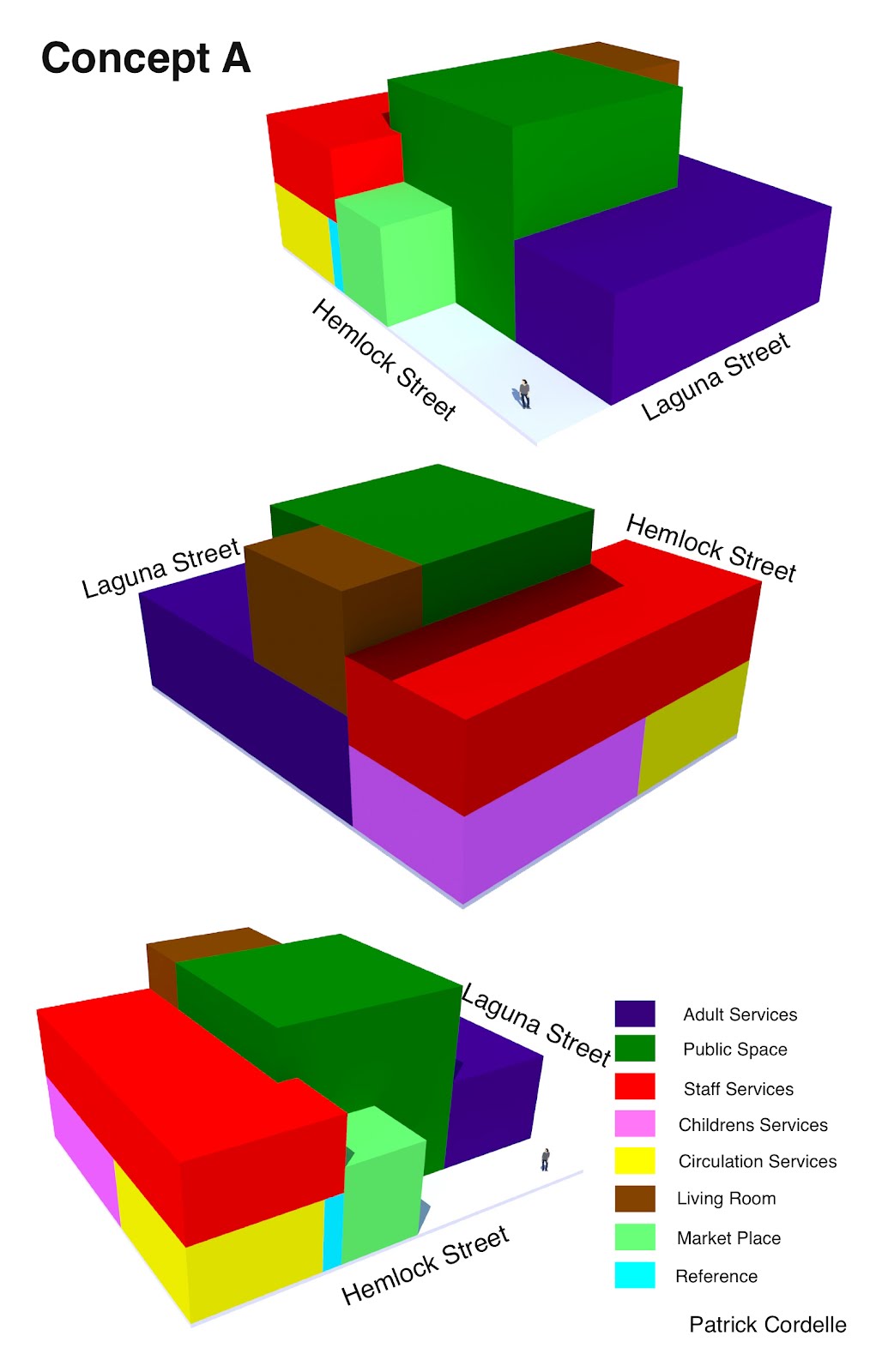


For Concept A, I wanted to create a design that has a public space at the core, a common feature in Japanese architecture. I did not place anything on top of this space so that it could be naturally lit with skylights. Around this public space I organized the other needed program space, keeping public areas and staff areas grouped together. The only public space above ground level is the living room, which has a corresponding deck space on the roof of the adult services. This deck would serve as an outdoor reading area for the library, integrating exterior space with the library.
For Concept B, I looked to the form of Mt. Fuji, the highest mountain in Japan as well as a cultural icon. The children’s services were placed in a location that would allow it to be used separately from the library. I also put the staff services on its own floor, so that employee spaces will not be accessed by the public. The peak of the building is the community living room, which has outdoor space around the room. The building is laid out so that the adult services room cantilevers over the entrance of the building, creating a transitional space from exterior to interior space, another common feature in Japanese architecture.
For the final concept, rooms were placed diagonally across the site, mimicking the long diagonal direction of japan when looking at the country on a map. Another important characteristic of the geography that I wanted to convey was the fact that the country is made of islands. I decided to completely separate the children’s services from the rest of the building, to minimize distractions in areas intended for older users. This also allows the children’s services building to be used separately from the library.
No comments:
Post a Comment