1.19.2012

Program Schemes: Book and Nature

Each of my schemes focuses on different ideas; however, similar themes arise in each. In my first scheme, my idea was create a spine for a library, like a book. I was attempting to discover what was as integral to a library as a spine is to a book. This lead me to try and figure out what holds a library together. In addition, I intended to enable patrons to connect with nature through outdoor roof terrace gardens that pulls the interior spaces out into the natural world. From this intent, I developed a large central stairway which connects each of the floors through an open vertical space and through providing a means of egress between the floors. This central stairway serves as the spine of the library, allowing people to navigate through the library while providing a space that ties the library together. This central stairway becomes as important to the circulation and feeling of the library as a spine is for a book. The spaces and program of the library spreads out like pages from this central stairway. Each level steps back from the one below it, creating space for an outdoor roof garden. This allows interior spaces to feel as though they spread out to nature even though the site is so small and has little room for garden space. This also allows the building to be more sustainable by creating a new greenscape within the city.

My second scheme was based on a Japanese garden and focused around the ideas of ma, or the undefined space between two rooms, and on the cover of a book. I approached this intent by separating the program into three buildings that could be connected with a flat roof. This roof would be like a cover of a book connecting different chapters of a story. These overhanging roofs would exist as Japanese roof gardens while providing a means of egress between the buildings. The three separate buildings are arranged in such a way that corridors and small courtyards are created between the buildings. These small courtyards and corridors are ma and would serve as garden spaces for reflection and relaxation within the library. The spaces inside the buildings are arranged so that the main adult, teen, and children spaces would have reading sections next to exterior windows that would allow people to connect with the Japanese gardens outside. This combination of space, transition, and rooftop gardens create an overall Zen feeling, providing a place of relaxation and sanctuary away from the bustle of the city.

The third scheme intended to connect the library with nature and focus around a central core. I approached this idea by designing a library with a central courtyard. The first floor of a building is an L-shape. This creates a courtyard space with an entrance that articulates with the Japanese temple located adjacent to the site for the building. Stacked on top of this L-shape is a rectangular level with a hole in the middle. This creates a central plaza and atrium space that cuts through the center of the building. The layers are stacked in a way that allows a rooftop garden to be created on top of the first floor which can be accessed from the second story. This allows people on all floors to look into a central garden space and across to spaces on the other side of the building. The spaces inside the building were arranged around this central atrium and allow patrons to look into the center, turning away from the busy city and connecting the natural atrium. The third level is only on one side of the central atrium and focuses the interior spaces toward the center. This central atrium space ties the entire building together and allows the people inside to escape away from the city and spend time focusing inward on nature and on knowledge.

Overall, each of my schemes connect patrons inside the library with nature outside and the integral parts of books, providing a space for the community to gather, relax and learn, and escape from the rest of the city.

Scheme 1


Scheme 2


Scheme 3

1.17.2012

Literary Connections


At its root, the Toda House by Kimihiko Okada is a single plane coiled upon itself. So I created the book as a continuous plane running from cover to single long sheet to cover. As interesting as that was, the single four inches by nine feet, ten inches page was impractical as a book. In addition the mylar made a rather flimsy cover.


My solution to these issues was to add bristol paper to the cover and accordion fold the strip into fourteen pages.


I attached the sheets and the covers together using traditional japanese stab binding running around the edges of the covers and the seams of the sheets. I created my own pattern based on the parallelogram I visible in the plan of the Toda House. 


All that remained was to bind it, but the instant I sewed an edge together like a traditional book I’d lose half of the page surfaces.


 Following the Japanese tradition of efficiency and flexibility in a small space I bound the book so that it opened in two directions with a new book appearing on each side.


The finished book resulted in a clean but slightly rough look due to the exposed stitches. Every joint, every layer, every stitch, and every seam is visible. It is clear to the naked eye exactly how the book was put together because unlike common American architecture, Japanese design celebrates the connections and construction of materials.


Toda Volume Diagram


A Volume Diagram of the Toda House


The Toda House (by Kimihiko Okada) was created with a very clear concept; a space created by a single coiled slab that served as both ceiling and floor. This divided the house into three separate parts, the slab, the indoor area between the layers of the slab, and the exterior space defined by the volume of the house.


So to diagram the book I naturally divided up the components of the book to match the three basic components of the house. The slab was represented by the cover of the book, serving as floor and ceiling to the pages which expressed the transparent but solid space of the interior. 


The remaining player, the void within the boundaries of the house, was just that, the absence of material.


The only remaining difficulty was how to create an overlapping coil of a single material while keeping the materials together. The solution was to carve out the basic hollow parallelogram plan of the building and make an incision through the non-binding side to the center.


Then I was able to manipulate the book so that the covers created a single continuous plane. All that remained was to cut away the spine cover and liner to reveal the binding and allow the exposed indoor space to continue.


A Hierarchy of Pages


The Oshikamo House, by Katsutoshi Sasaki + Associates, could simply be described as an inconspicuous shell filled with spaces with varying degrees of: privacy, light and importance. So, to express these aspects in a book makes quite a good deal of sense, because a book can be described in a similar way: nondescript covers filled with pages of literary space.

My process of subtraction was meant to expose the hierarchy of spaces within the project. I focused on looking at the project in section, allowing the covers to act like the anodized aluminum siding, the pages as the spaces within, and the spine as the foundation and central public corridor. The first thing that is evident when looking at the book is the curvilinear shape that is cut into the covers. This allows the visual connection between the book and the original project without being impeded by the iconic shapes the house is known for and solidifying the description of the covers/elevations as a simple box around interesting spaces. The areas with the most subtraction lie in the middle of the book, representing the central public core of the building and the glass light well, that goes from floor to roof, that is the defining moment of the house. The other spaces represent the more private spaces, the bedrooms and sitting area one step higher than the central core and the bathroom with the least subtraction.

I think this diagram is successful at homing in on the central design aspects of this project. It gives you another view of the separation of public and private spaces in a way that allows you to experience the entire building at one time.

Hidden Views


Unlike my diagram on the Oshikamo house, where I focused more literally on the hierarchy and separation of spaces, I chose to approach the construction of this book in a more abstract way. I wanted to focus on the idea of view corridors, view separation and the idea of hidden spaces.

The first decision I made was to make the book viewable from two sides, essentially making two books in one. This alludes to the architects’ decision to separate private and public spaces by altering what one can see. If one looked at one side of the book as representing public space and the other side as private from either side you can only get a partial view of the other. The cover is essentially three separate panels, the two solid “exterior” covers, and the “interior” cover which has a “corridor” in the center, giving a physical connection between the two sides (public and private) but making it impossible to see all parts of the book at once. The covers are made up of 5x5 inch squares of Bristol, lightly dyed with green tea, sandwiched between two squares of Mylar, that are melted together. There is also a pattern stitched into the covers, which is an overlay of all the possible circulation paths in the house, but it is not out rightly discernable, which hints at the idea of a series of spaces behind a plain exterior. The pages themselves are stitched together with an x-stitch I came up with which brings in the iconic x shape of the project into the book.

Like the Oshikamo house, which is plain on the exterior but filled with varying views and spaces, this book allows the reader to see only what the designer intends. Moments that allow exploration and those that stimulate introversion.

BOOK Binding


This book is now resulting affter researching and understanding the complex house. It has a cover page, which is enclosed with mylar. The back of the book is a sheet of mylar, as well. In between are 47 pages of 2-ply Bristol paper.

The size of the book or rather the ratio of the pages is related to the ratio of the complex house. The actual size is 6” 3/4 by 3” 5/8.

The pattern of the cover page is reflected from the floor plan of the house. The circulation has the same pattern on the 1st and 2nd floor. This pattern of the building's circulation seams to be very important. You can see in the picture above, the circulation and the two rooms, which are connected by it, are colored red. This red figure has been developed to the final pattern by reflecting, rotating and duplicating it.

The pattern is also recognized at the bookbinding. The stitches are lined up to get the same pattern. This specific type of bookbinding was chosen to provide a fully opening of the book.

BOOK diagram


This is a diagram of the complex house by Tomhiro Hata displayed with a book. The complex house is a rectangular cuboid, from which has been removed some parts, if you viewed simply. The book represented in this study the cuboid.
I was focused to have the diagram in the same ratio of the house’s height and length. I cut about an inch in the length of the book to adjust this. The depth of the book hasn’t got the same ratio.

From this point, I had to cut the book into the shape of the complex house. I’ve cut five alternating triangles out of the book to symbolize the roof structure and I’ve also cut a little rectangular piece by the binding to picture the entry. You’re even able to see a void, which is representing the patio when you open up the cover. This also shows the high privacy of the fully enclosed outside space.

I let the cover almost untouched around the binding, which should represent the ground floor. I’ve also cut holes in the upper part of the cover to show the voids of the second floor. This should show how the system of that building is working. How Hata achieves a high privacy and proper living conditions in a high dense environment.

InBetween Book


In an initial approach to the creation of a book, I investigated the basics of Japanese book joinery. We needed to make design connections from the book we were creating and the house we studied in our previous stages of the project. In order to devise a solution to this problem I took the ideology of Japanese book binding techniques, and further stretched them into the tectonics behind Japanese origami in a materials connection to the paper of the book, and Japanese joinery in the way the binding would hold them together.

The home which I studied was modeled around a set of five singular cottages cohesively stitched together through the use of their space in-between and the connection of their roof structures. In response to this my book has five separate pages, each of which unravels from an identical series of folds, designed intentionally to interact the user and the pages themselves. When the book is opened the pages are turned into loose-leaf, free to be arranged as you please, much like the house would be without the presence of its unifying roof. Which brings me to the ideology behind the cover and binding. With intentions of replicating the folded characteristics of the pages, while seamlessly tying it’s contents together, the cover itself features a series of folds while being held closed by a single stab bound point.

Looking back upon my solution to this step of the project, there’s definitely space for improvement. This space seems to lie mostly within the cover. The cover’s complexities detract from the complexity within the page design, and creates a certain disconnect from the relation to the simple unification of a series of spaces. With a more primitive covering tactic, the pages could have a greater impression upon the piece as a whole.

Roof House Construct


The constructive process for my book began with trying just to focus on only one feature of the house. It wasn't hard to pick a specific feature because the main reason for the house was the roof. To show that the clients were going on and off the roof I alternated the height of the pages to portray the experience of going in and out of the house onto the roof. The smaller pages I used them as any interior living space and the taller slanted pages I used as living on the roof since the height also rose above the book (the cover). I not only wanted to show the roof in a vertical way, but I wanted to show the roof experience as the reader experienced the book. In order to do so I divided the interior and roof spaces as different sections. The sections alternated in directions, the interior read from left to right and the roof read from right to left also making a connection to Japanese literature. The heights of the sections were relative to their respective spaces. I used one continuous cover that ran from the front of the book to the end dividing and parting the different sections.


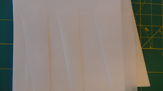
For my pattern I again wanted to stress the alternating living spaces of on the roof vs in the house. I then cut alternating slots that represented the roof pitch and the interior space. As the slots reached the top of my book I also used the pages of the book to continue the pattern and be a part of the pattern itself. Finally I cut out a rectangle and inserted them into the slots to represent someone experiencing going in and out or on and off the roof.