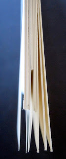
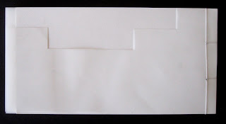
For the book project, I first began with an overall book size of five inches by ten inches, referencing the to 2:1 proportions of traditional Shoji Screens and the long narrow site of House A. The book is divided into 5 chapters, representing the 5 rooms in Nishizawa’s House A. The chapters are separated by a full sheet of mylar, and the pages of each chapter are different lengths, corresponding with the different ceiling heights of House A. Each chapter has 2 pages, and the four sides of these pages are a reference to the four walls of each room. I chose to stitch the book with two holes, creating 3 squares that mimic the placement of the mullions on the windows of House A. For the cover design, I used a modular pattern that is an abstraction of the roof heights of the building. The book was intended to be simple and clean, like the architecture of House A.


For the book project, I first began with an overall book size of five inches by ten inches, referencing the to 2:1 proportions of traditional Shoji Screens and the long narrow site of House A. The book is divided into 5 chapters, representing the 5 rooms in Nishizawa’s House A. The chapters are separated by a full sheet of mylar, and the pages of each chapter are different lengths, corresponding with the different ceiling heights of House A. Each chapter has 2 pages, and the four sides of these pages are a reference to the four walls of each room. I chose to stitch the book with two holes, creating 3 squares that mimic the placement of the mullions on the windows of House A. For the cover design, I used a modular pattern that is an abstraction of the roof heights of the building. The book was intended to be simple and clean, like the architecture of House A.


No comments:
Post a Comment